When you
create your maps with the help of online services, sometimes you surely want
not only to see your data on the map, but also to make at least some
mathematical analysis. For example, to create a chart reflecting the change in
the data and to estimate how much your data is correlated in some attributes
and to construct a linear regression equation. Not every online service for
maps creation provides such an opportunity. In OpenWebGIS you can do it. In
this article, we'll start talking about how you can do it yourself in your
service using JavaScript language.
The whole
code you can see in the function "ApplyChart" in the file
"table.htm", if you download the javascript code using the menu item
of OpenWebGIS "JavascriptSourceCode".
But this
function is very large, since it solves many tasks, depending on the user's
choice, but at the moment we are only interested in the process of calculating
the correlation and linear regression equation coefficients. Next, we will
describe user`s actions that involve the appropriate function blocks of
"ApplyChart".
So let us
start with the choice of data in the example of which we will show a
mathematical calculation. We offer to take the data on hurricanes in the North
Atlantic in 2004. Let's take the information about the three hurricanes of this
season: IVAN, CHARLEY and JEANNE. We have put
these hurricanes tracks on the OpenWebGIS map .The result is shown in Figure 1.
 |
| Figure 1 |
You can open the map in
this link. Further in order the users could analyze the
data of the layer "Hurricanes2004", they must select the name of the
layer (in this case select the layer "Hurricanes2004") with which we
will work in the list of "Editable Layer" and click on the menu item
"Edit->Open attribute table".
After that the new window will open (or Tab) "table.htm" and
the user will see what is shown in Figure 2.
 |
| Figure 2 |
Next, the
user must specify which layer attributes will be used for creating the chart on
the X axis and on the Y axis. Let`s suppose for example the attribute
"PRESSURE" is along the X axis and the wind speed "WIND_MPH"
is along the Y axis. In order to get a calculation of the correlation
coefficient and the regression equation, the user must activate the "get
line regression equation (y/x)" option.
Now finally
we will turn to the JavaScript code. To describe it, we need to know the
identifier of the "select" element in which we select an attribute on
the X axis: id = "fieldChartX", on the Y axis: id =
"fieldChartY". Checkbox element ID for activating the process of
correlation calculation is: id = "id_CorrRegV".
For
creating charts in OpenWebGIS the canvas element is used. So everything that in
ApplyChart function refers to the correlation calculation begins with this:
if(document.getElementById ('id_CorrRegV'). checked == true) {
Be sure to have checked
whether the user has specified the attributes for the X and Y axes and report
the error to the user:
var atX=document.getElementById("fieldChartX").value;
var atY=document.getElementById("fieldChartY").value
if(atX=="0"||atY=="0")
{alert ("select value"); return;}
It is also important to check that the selected attributes of the analyzed layer contain numeric data and their number on the axes is equal to:
var countV1 = 0; var feat1 = '';
var mLayers=window.opener.edilayerMainLayer;
countV1=mLayers.features.length;
feat1=mLayers.features;
var atrY=document.getElementById("fieldChartY").value;
if(isNaN(mLayers.features[0].attributes[atrY]*1)==true)
{alert("Error value is string "); return;}

var countV2 = 0; var feat2 = '';

countV2 = mLayers.features.length; feat2 = mLayers.features;
var atrX=document.getElementById("fieldChartX").value;
if(isNaN(mLayers.features[0].attributes[atrX]*1)==true)
{alert("Error value is string "); return;}
if (countV1!=countV2)
{alert("number of first value not equal number of second value"); return;}
After
reviewing the code given above the question raises - What is the meaning of
these expressions: "window.opener.edilayerMainLayer" and
"mLayers.features"? To understand this, it is necessary to bear in
mind that in OpenWebGIS to create maps and layers on the map, JavaScript OpenLayers
library is used. More about this you can see in the article
"Heatmap, JavaScript, Openlayers and canvas". So in
expression "window.opener.edilayerMainLayer" we appeal to the global
variable "edilayerMainLayer", created in the main window
("opengis_eng.html") using the function "SeteditlayerMain(editlayerM)".
This variable is qual to the analyzing layer (in this case,
"Hurricanes2004") and its contents. Using the
expression "mLayers.features" we obtain an array of all features
(points, lines, polygons with their attributes, in this case it is the pressure
and speed of the wind). In order to make it clearer what "features"
are, we suggest to look at the documentation
of the object "OpenLayers.Feature" with the help of which
every element of the array is created.
But in your case you do not have to use OpenLayers and instead of an array
"mLayers.features" there can be any other array containing your data.
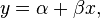
Get to
the calculation of the correlation
coefficient and the coefficients of the regression equation. But
first, we must refresh our memory on the mathematical theory of it. Please read
about Correlation and dependence. So the
sample correlation coefficient is written in Figure 3:
 |
| Figure 3 |
where x and y are the
sample means of X and Y, and sx and sy
are the sample
standard deviations of X
and Y. To make
these calculations using JavaScript, we have to loop over all the elements of
the array "feat1" equal to "mLayers.features":
var mean1 = 0; var mean2 = 0; sumV1V2 = 0; squaredVal1 = 0; squaredVal2 = 0;
var fielY=document.getElementById("fieldChartY").value;
var fielX=document.getElementById("fieldChartX").value;
for (var i = 0; i< feat1.length; i ++)
{
mean1 + = parseFloat (feat1[i].attributes[fielY]);
sumV1V2+=parseFloat(feat1[i].attributes[fielY])*
parseFloat(feat2[i].attributes[fielX]);
squaredVal1+=parseFloat(feat1[i].attributes[fielY])*
parseFloat(feat1[i].attributes[fielY]);
mean2 + = parseFloat (feat2[i].attributes [fielX]);
squaredVal2+=parseFloat(feat2[i].attributes[fielX])*
parseFloat(feat2[i].attributes[fielX]);
}
After
passing this "for" loop, calculate the means of X and Y:
mean1 = mean1 / feat1.length;
mean2 = mean2 / feat2.length;
Then
calculate the variance of X and Y:
sumV1V2 = sumV1V2 / feat1.length;
variance1 = (squaredVal1 / feat1.length) - (mean1 * mean1);
variance2 = (squaredVal2 / feat1.length) - (mean2 * mean2);
Finally calculate the sample correlation coefficient:
CoefCorr=(sumV1V2-(mean1*mean2))/(Math.pow(variance1,0.5)*Math.pow(variance2,0.5));
Where
"Math.pow(variance1,0.5)" and "Math.pow(variance2,0.5)" is standard deviations sx
and sy .
Function
"Math.pow" - is exponentiation function. Expression
"Math.pow(variance1,0.5)" according to the rules of mathematics is equivalent to
the square root of variance1.
Calculate the regression
coefficients according to the rules:
 |
| Figure 4 |
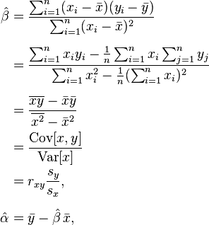 |
| Figure 5 |
In
javascript syntax it will be:
var b = (sumV1V2-(mean1*mean2))/variance2;
var a = mean1-b * mean2;
The results
are recorded in the item "textarea" element:
if (document.getElementById ('id_CorrRegV'). checked == true)
{
var DivAreaLeg = document.createElement ("textarea");
DivAreaLeg.id = "id_correlDiv_textarea";
DivAreaLeg.style.width=250;
DivAreaLeg.style.height=80;
if(!document.getElementById("id_correlDiv_textarea"))
{document.getElementById("id_correlDiv").appendChild(DivAreaLeg);}
document.getElementById("id_correlDiv_textarea").value=
'correlation coefficient:'+CoefCorr+'\n'+'varianceY:'+
variance1+'\n'+'varianceX:'+variance2+'\n'+
'regression equation:'+document.getElementById("fieldChartY").value+'='+
a+'+'+b+'*'+document.getElementById("fieldChartX").value;

var adCorr=a+b*
parseFloat(window.opener.edilayerMainLayer.features[0].attributes[fieldSel2]);
var NumberChartC = (maxDistC-adCorr)/parseFloat(cenDel);
context.fillRect (LenX * 0 +40, NumberChartC, 3, 3);
context.beginPath (); context.moveTo(LenX * 0 +40, NumberChartC);
var var_last=window.opener.edilayerMainLayer.features.length-1;
var adCorr2=a+b*
parseFloat(window.opener.edilayerMainLayer.features[var_last].attributes[fieldSel2]);
var NumberChartC2 = (maxDistC-adCorr2)/cenDel;
context.lineTo(LenX*((arrayFeat2.length-1)) + 40, NumberChartC2);
context.stroke ();
}
Here, the
variable "context" is the context of canvas
element in which our chart is creating. On page "table.htm" it
is defined as follows:
var myWinChartKV = window;
 var drawingCanvas0 = myWinChartKV.document.getElementById ('id_canvas1Chart');
var context = drawingCanvas0.getContext ('2d');
But we are not going to tell about the chart
creating using the canvas element in this article, because it is a topic for
another article.
So the function "ApplyChart()" (parts of which
we have described above) is linked to the button "Create Chart". After
the user selects the axes X and Y and activates the option "get line
regression equation (y / x)" and clicks "Create Chart" button -
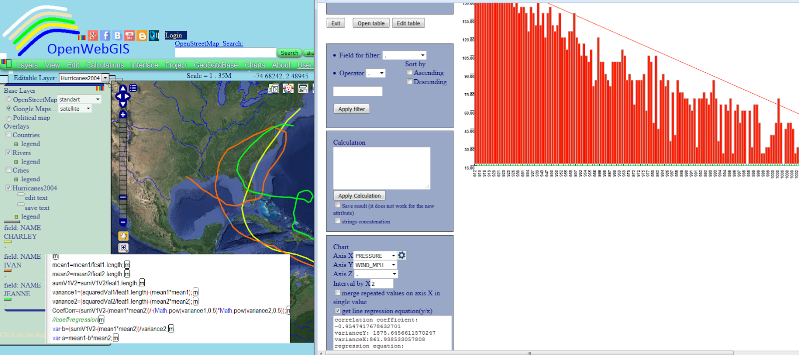
the user will see the result as shown in Figure 6.
 |
| Figure 6 |
Pay your attention to a textarea element (in
the lower left corner), there all calculated coefficients and variances are
listed.
As can be seen, the regression equation:
WIND_MPH = 1456.3434664919223-1.4083907778030962 * PRESSURE,
and correlation
coefficient= -0.954741767863270 describe well the identified dependence of wind
speed and pressure in hurricanes. The user can customize the chart style
(using the "open options of chart") such as shown in Figure 7. How to
do it with the help of JavaScript we will discuss in other articles.
 |
| Figure 7 |
But attention! In this
article we used the data on the three hurricanes at the same time only as an
example for the calculation of regression and correlation coefficient. And the
resulting linear relationship can not be used for any scientific conclusions. In
fact, it is desirable to analyze the data on hurricanes separately. Also
depending on the time passed since the beginning of the hurricane and depending
on the location within the hurricane, pressure and wind speed have much more
complex relationship. The relationship is linear only in some track parts. It
can be seen from Figures 8 and 9.
 |
| Figure 8 -
Wind Speed,
Gust, and Sea Level Pressure at Cape Lookout, NC during Hurricane Irene (taken
from the site of NOAA http://www.ndbc.noaa.gov/hurricanes/2011/irene/)
|
 |
|
Figure 9 -
Pressure and Winds in hurricanes,
|
That's all,
I wish you success in the automation of mathematical calculations and creating
charts and maps using JavaScript.
No comments:
Post a Comment